
¿QUÉ ESTÁS BUSCANDO?
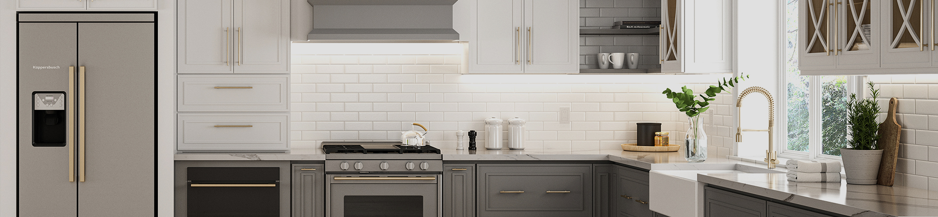
The kitchen is the functional carrier and emotional heart of a home. Color selection stands as one of the most critical decisions in kitchen design. While wall paint and decorative ornaments can be replaced anytime, kitchen cabinets represent a high‑investment, long‑cycle renovation item with a service life of 10‑20 years. Picking the wrong cabinet color will not only ruin the overall aesthetic of the space but also trigger a host of troubles: distorted visual proportions, multiplied daily cleaning difficulty, and a gloomy, uncomfortable atmosphere that dampens mood over long‑term residence.
Therefore, when shopping for kitchen cabinets, certain colors should be avoided to preserve your overall interior style. These unrecommended cabinet finishes carry inherent drawbacks, and kitchen remodels later on will incur extra costs. Steer clear of solid black, cool stark white, high‑saturation neon/fluorescent shades, bright red, and metallic gold / shiny champagne gold.
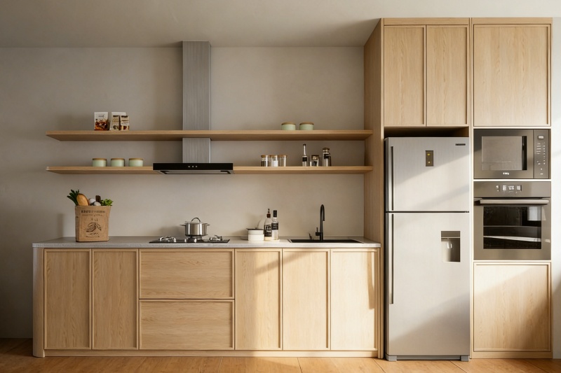
1. Solid Black / Matte Solid Black: Gloomy Space & High‑Maintenance
Many homeowners opt for all‑black cabinets to achieve a minimalist, upscale industrial look. Yet this is among the riskiest color choices for kitchens. From an optical perspective, black absorbs light intensely and visually shrinks space. Even in large open‑plan kitchens, full‑wall black cabinets make the area feel cramped, dim and somber, erasing the bright, cozy vibe a kitchen ought to have.
Matte‑black painted kitchen cabinets also have critical practical flaws. Their surfaces show dust, fingerprints, watermarks and cooking grease residue extremely visibly. Dust, soap scum and limescale stand out far more prominently on black cabinetry than on light‑colored alternatives. Frequent wiping is required to keep them tidy; even minor neglect leaves the kitchen looking messy and strips away all refined appeal.
According to color psychology, prolonged exposure to large‑scale black kitchen surfaces may cause visual fatigue and low spirits, diminishing the warmth brought by cooking and dining. Moreover, solid‑black cabinets have poor trend adaptability. Warm‑toned modern styles dominate contemporary interiors, and all‑black kitchens now feel dated and rigid, which can even hurt resale property value.
Alternative options: For those drawn to dark cabinetry, choose deep charcoal grey or dark walnut. These finishes retain the understated premium feel of dark tones, reduce light‑absorbing downsides, ease cleaning burdens, and match most mainstream home‑decor styles.
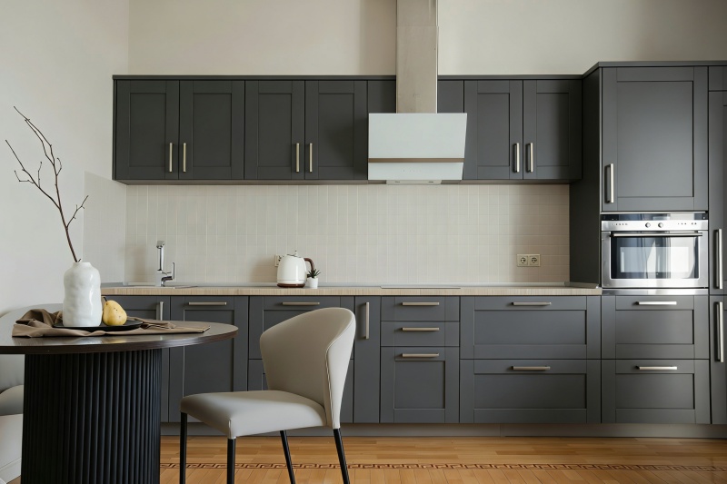
2. Cool Stark White: Cold, Sterile & Prone to Stains
White frameless plywood kitchen cabinets are widely regarded as a timeless versatile pick. Nevertheless, cool stark white with zero warm undertones is a classic renovation pitfall in kitchen design. Though white is generally adaptable, cool stark white differs greatly from soft creamy white. Its high brightness with no warm tonal layers renders large cabinet surfaces cold, harsh and sterile, robbing a domestic kitchen of its homely warmth.
Practically speaking, cool stark white stains far more easily than warm white. Untended spills such as ketchup, coffee and fruit juice can leave permanent marks. Without careful upkeep over years of use, local yellowing occurs, leaving cabinets looking worn and patchy.
Color‑psychology research shows that spending long hours in a cool‑stark‑white kitchen weakens one’s sense of belonging and comfort, discouraging extended stays — contrary to the kitchen’s role for shared meals and relaxation. For coordination, cool stark‑white cabinets impose strict demands on floor tiles, wall colors and lighting. Warm‑toned flooring or yellow indoor lighting creates obvious color discontinuity and mismatching, breaking stylistic harmony.
Alternative options: Warm ivory white, cream white, off‑white. Gentle warm undertones soften the space while preserving white’s clean, airy quality. They greatly improve color‑matching tolerance and long‑term durability.
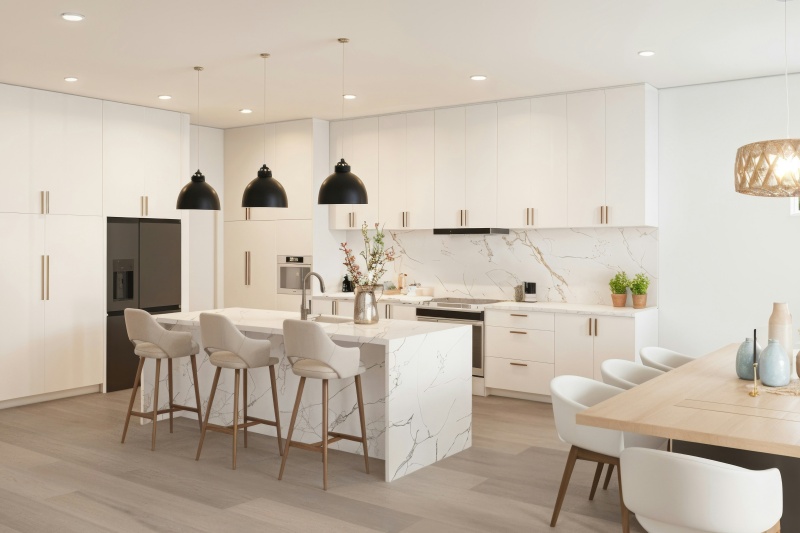
3. High‑Saturation Neon / Fluorescent Shades: Fleeting Trend & Visual Fatigue
Neon pink, fluorescent green, vivid yellow and high‑saturation bright orange are ill‑advised cabinet colors. Dubbed short‑lived internet‑viral hues, they deliver striking novelty at first sight but fail for long‑term living. Optically, high‑saturation fluorescent finishes reflect light intensely. Applied broadly within the enclosed kitchen environment, they produce powerful visual stimulation.
As a heavily used domestic zone, a kitchen with large neon‑toned cabinetry causes eye strain, headaches and irritability over prolonged viewing. Stylistically, these colors have very limited compatibility. Their bold individuality clashes with mainstream aesthetics including modern minimalist, Nordic and classic American styles, suiting only extremely niche custom renovations.
From trend cycles and property‑preservation perspectives, neon‑colored cabinets age rapidly. Viral color palettes evolve fast; such bold finishes become outdated within one or two years. Furthermore, overly personalized cabinetry narrows the pool of potential homebuyers. In real‑estate resales, neon‑themed kitchens act as a major disadvantage, hurting transaction likelihood and sale price.
Alternative options: Low‑saturation Morandi tones, such as sage green, soft cream yellow, misty powder. Muted shades feel gentle and distinctive without being overly mainstream. They boast broad stylistic compatibility and rarely trigger visual tiredness.
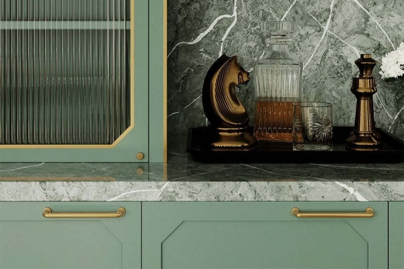
4. Bright Red: Emotional Anxiety & Poor Compatibility
Some homeowners select bright‑red cabinets to create a warm atmosphere. However, from color‑psychology and functional‑design viewpoints, high‑saturation bright red should be avoided for extensive kitchen use. Its strong visual impact and high visual energy over‑stimulate nerves and raise heart rate. Large areas of bright red in kitchens may leave occupants persistently irritable and anxious, undermining relaxed cooking and dining experiences.
Aesthetically, bright red draws overwhelming visual focus, flattening spatial layers and creating a stiff look. Bright‑red cabinets also impose stringent whole‑house styling requirements with little margin for error; later soft‑furnishing adjustments can barely remedy stylistic imbalance.
Alternative options: Brick red, stained cherry solid‑wood farmhouse kitchen cabinets. Deeper, subdued retro‑inflected tones stay relatively low‑key, place fewer constraints on surrounding decor, preserve warm qualities without nervous‑system over‑stimulation, and fit kitchen atmospheres better.
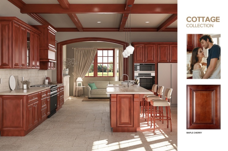
5. Metallic Gold / Shiny Champagne Gold: Tacky & Hard to Coordinate
Many homeowners believe metallic‑gold cabinets deliver opulent high‑end kitchen aesthetics. In reality, metallic gold tends to look ostentatious and tacky, contradicting true light‑luxury sophistication. Kitchens prioritize practicality and homely comfort, while highly reflective metallic gold belongs more to commercial spaces than everyday residences.
For maintenance and fine detailing, metallic‑gold cabinetry magnifies imperfections: fine scratches, uneven paintwork and installation gaps become highly visible, making details appear cheap and shoddy. It also pairs poorly with common kitchen materials like wood and stone, resulting in flashy, disjointed interiors. Solid metallic‑gold cabinetry has largely been phased out of mainstream residential design.
Alternative options: Reserve antique brass or brushed gold only for accent details. Deploy these metallic elements on hardware, handles and light fixtures to craft refined luxury, avoiding visual clutter and aesthetic burnout.
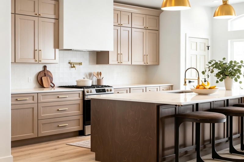
Three Core Principles for Kitchen Cabinet Color Selection
To steer clear of color‑matching missteps at the source, follow these three design principles, applicable regardless of kitchen size or natural‑light conditions:
1. Prioritize low‑saturation neutral colors: Grey‑beige, mushroom, warm white, earth tones and similar neutrals offer maximum forgivingness, broad stylistic fit and simple upkeep. They sustain timeless visual appeal and represent fail‑safe long‑term cabinet color choices.
2. Match color to space size & natural light: For small kitchens or poorly lit spaces, steer away from dark shades and cool high‑saturation hues. Large open‑plan kitchens may incorporate limited dark tones for layering, but avoid full‑coverage dark cabinetry.
3. Balance practicality and visual appeal: A kitchen is first and foremost a functional space, secondarily decorative. Color schemes that sacrifice cleaning ease, spatial comfort or long‑term wear‑in beauty for momentary visual wow‑factor qualify as poor design.
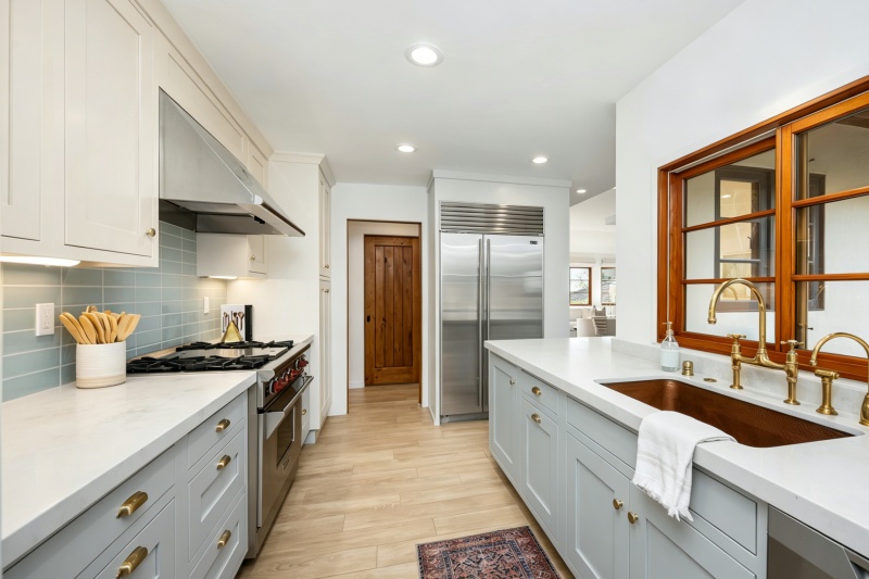
Conclusion
This cabinet‑color avoidance guide is not merely about subjective taste. Its purpose is to prevent mismatches between color properties and kitchen functions, built‑in surroundings, and long‑term household needs. Solid black, cool stark white, high‑saturation neon tones, bright red and metallic gold commonly lead to gloomy ambience, high cleaning demands, visual fatigue and fast‑dating aesthetics.
High‑quality cabinet color design centers consistently on durability, practicality, comfort and versatility. Pick low‑saturation neutrals calibrated to your kitchen’s lighting and dimensions. You will achieve a soft upscale kitchen mood, extend cabinet service life, boost home resale value, and keep your kitchen timeless amid shifting design trends.


 Hoja informativa
 English
 IPv6 RED SOPORTADA